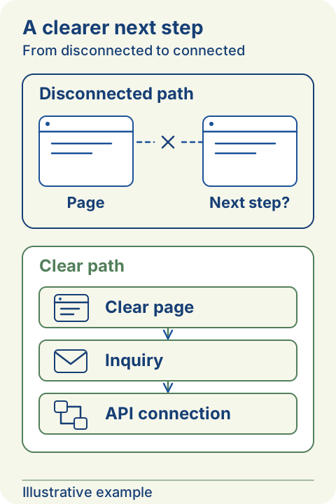
Start with the visitor's decision
Choose one service page and name the decision it should help a visitor make. Someone comparing providers may need scope and examples before discussing a project. Someone with an urgent support request needs a different route.
Read the fuller explanation
Sketch the journey on paper: entry page, information needed, contact action, and reply. At each step, write the question a visitor might still have. Remove detours that do not answer a question or help complete the task.
Make the button describe the next step
A label such as 'Discuss a website project' tells people more than 'Discover more'. Match the label to the actual destination. A button that opens an email draft should say that it opens email; it should not claim to submit a request.
Read the fuller explanation
Give the main action room to stand out, but keep supporting links available for readers who are not ready. Check the path on a phone and with a keyboard. You should be able to see which control is focused and understand its label without relying on an icon.
Ask only what the first reply needs
For every form field, write why the answer is needed before the first conversation. Contact information and a short description may be enough to begin; a detailed brief can follow later. Explain optional questions rather than making every field compulsory.
Read the fuller explanation
Keep labels visible, explain errors beside the affected field, and preserve answers when validation fails. Tell people how their details will be used. Do not request passwords, payment information, or confidential business documents in an initial inquiry.
Verify the handoff, not just the screen
Test the contact route from start to finish using clearly marked test details. For a real submission service, verify that the intended recipient receives the message and that failure states do not display success. For an email draft, the visitor still needs to send it in their own email app.
Read the fuller explanation
Agree who checks incoming inquiries and what reply expectations the website can honestly set. Review the quality of conversations alongside any counts. More button clicks alone do not show that visitors understood the service or received a reply.
Before your next conversation
- Draw the complete route from service page to reply.
- Match each button label to its actual behavior.
- Remove fields that are unnecessary for the first reply.
- Test keyboard use, mobile layout, and error recovery.
- Confirm who receives inquiries and how they are followed up.