Skip to content

Explore concept studies

Two concepts, with the thinking made visible.

Explore how a website can explain an offer and guide the next decision. These studies use existing visual assets to discuss possible structures, not completed client engagements.

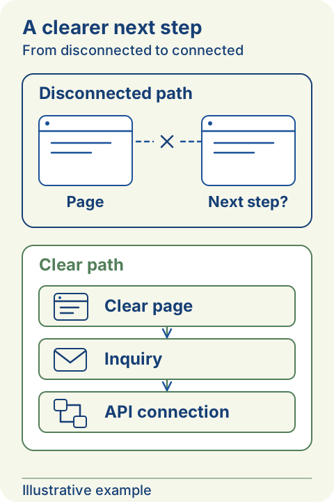
Illustrative comparison: a disconnected website path ends without a next step; a clear page connects an inquiry to an API.
Illustrative example — replace a disconnected path with a clear page-to-inquiry-to-API flow.

Both studies are concepts. Images are visual references from the site, not evidence of a commissioned project. Benefits are intended, not observed client results; no performance data is claimed.

Concept study · 01

An interior offer with a clearer inquiry path
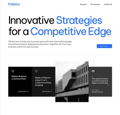
Existing interior and furniture website visual used as a concept reference

Challenge

For this hypothetical brief, an interior business needs to explain what it supplies before asking for a project inquiry. A large photograph alone does not answer questions about scope, suitability, or how to begin.

Intended benefit

The intended benefit is a better informed first conversation, with visitors able to describe their needs. This has not been tested with a client, and the concept does not establish any increase in inquiries or sales.

Explore the design decisions and takeaways

Approach

Use the existing interior and furniture visual as a reference, then outline the visitor's questions in order. Separate the service offer from supporting imagery, and place practical project information before the contact action.

Proposed solution

The proposed structure opens with a specific service description, follows with examples labeled by context, and explains what information to bring to an inquiry. A service link lets readers check the scope before contacting the business.

Takeaway

Use photographs to support the offer rather than replace it. To evaluate this idea, ask unfamiliar readers to explain the service and the next step, then record where the proposed page still leaves questions.
Read the guide: A credible website starts with a clear offer

Concept study · 02

A product catalog that supports comparison

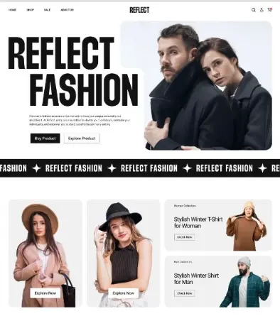
Existing e-commerce website visual used as a product catalog concept reference

Challenge

In this hypothetical store brief, shoppers need enough product detail to compare options before choosing one. An attractive grid can still leave uncertainty about variations, availability, or what happens after selection.

Intended benefit

The intended benefit is easier comparison and fewer unanswered questions before an order or inquiry. No store has been measured for this study, and the concept does not claim better conversion or fewer support requests.

Explore the design decisions and takeaways

Approach

Treat the existing e-commerce image as a visual starting point, not as a functioning store demonstration. Map a journey through categories, product information, and the next action, noting where stock or delivery information is needed.

Proposed solution

The proposed catalog uses consistent product summaries and a detail page with options and ordering guidance. Payment, inventory, delivery, and account integrations would need a separate feasibility review and an agreed implementation scope.

Takeaway

Plan product information and operational responsibilities together. Before building checkout, confirm who maintains the catalog, how availability is checked, and what the customer sees when an order cannot be completed.

Read the guide: Make the path to an inquiry easier to understand